
Today, Creative Team Member Laura is sharing tips for Adapting Colorful Artsy Layered Templates to coordinate with her photos.
Follow along in Adobe Photoshop and Elements as Laura describes the processes she uses and the design decisions she makes when adapting an Artsy Layered Template to work with her photos.
Adapting Colorful Artsy Layered Templates
Introduction
There are 2 types of Artsy Layered Templates.
- Grayscale
- Colored, with Transfers and Overlays included.
Both types are designed to be modified and recolored as preferred:
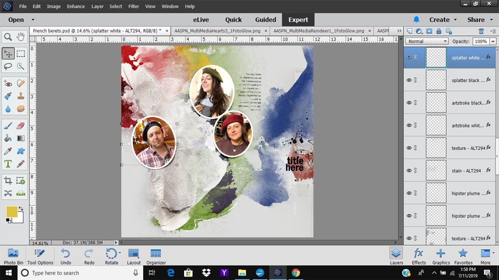
- Laura selected Artsy Layered Template No. 294 to support her vision for showcasing gallery portraits on a wall.
- The colors of the neutral photos in the photos differed substantially from the bright bold colors in the template.
- She adjusted the colors and the design to better support her images.
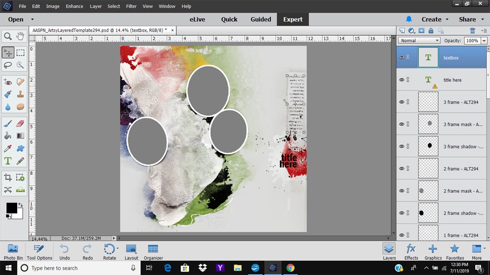
1. Establish a Layout Foundation
Select a template and add the photos to create a photo artistry or digital scrapbooking layout foundation.
- Open the Artsy Layered Template into your Photoshop or Elements work space (File> Open.)
- Clip your photos to the frame layers in the Artsy Layered Template.
- Place the photo layer directly above the frame mask layer in the Layers Panel (Layer> Create Clipping Mask.)
- To remove any color distraction, turn off all the visibility of the layers excluding the photos, frames, masks, shadows and text/title.
- Click the ”eye’ icon to the left if each layer to next to each layer to toggle visibility on and off.
Note. Laura prefers to leave the text and title visible when working with an Artsy Layered Template so that I do forget about these critical design elements
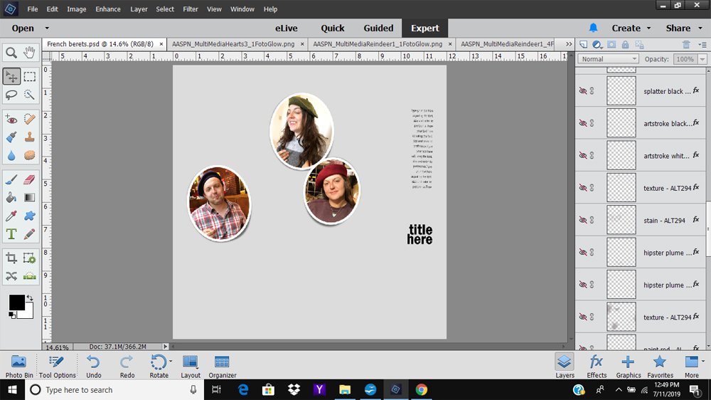
2. Assess the Artsy Template Layers
Establish whether the color on each of the layers coordinates with your photos.
- Turn on the visibility of each layer one by one, starting at the bottom of the Layers Panel.
- Work from the bottom of the Layers Panel upwards.
- Click on the ‘eye’ icon to the left of the layer to make the elements on each layer visible on your layout.
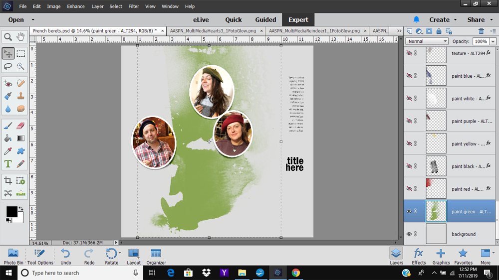
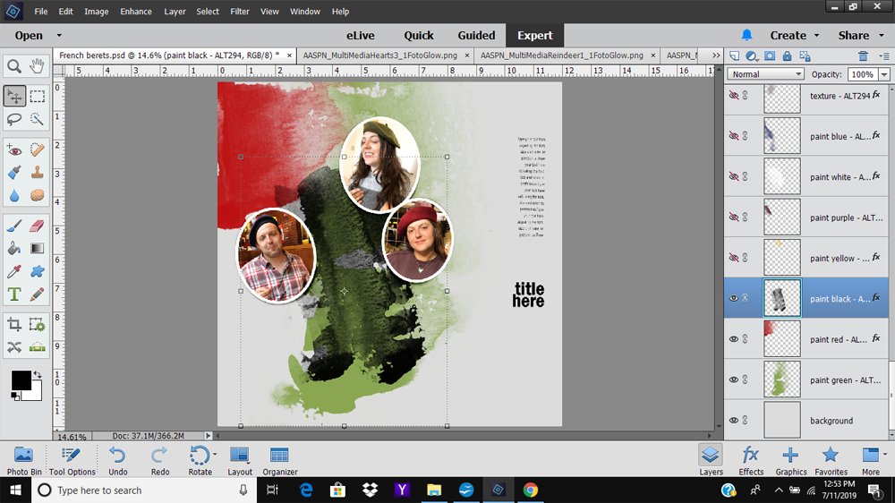
- In this case, the first ‘reveal’ is a green paint layer.
- Notice how the color coordinates with the the moss-colored hat in the top photo.
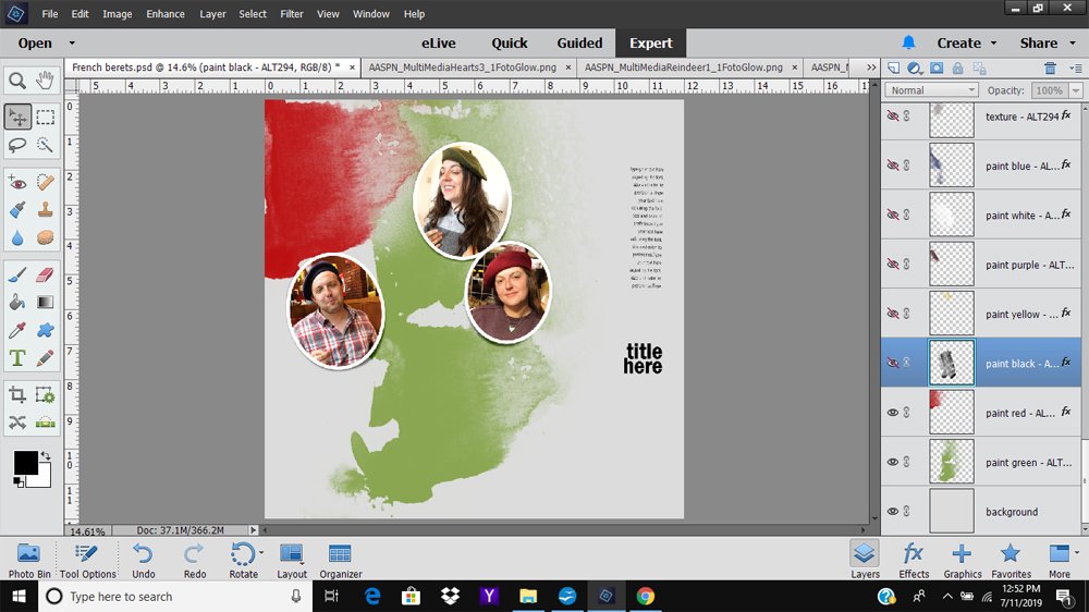
- The second layer is red and also works well with the photos.
3. Recolor Template Layers
Change the color of layers to support the colors in your photos.
- The third layer is black and overpowering to the overall design.
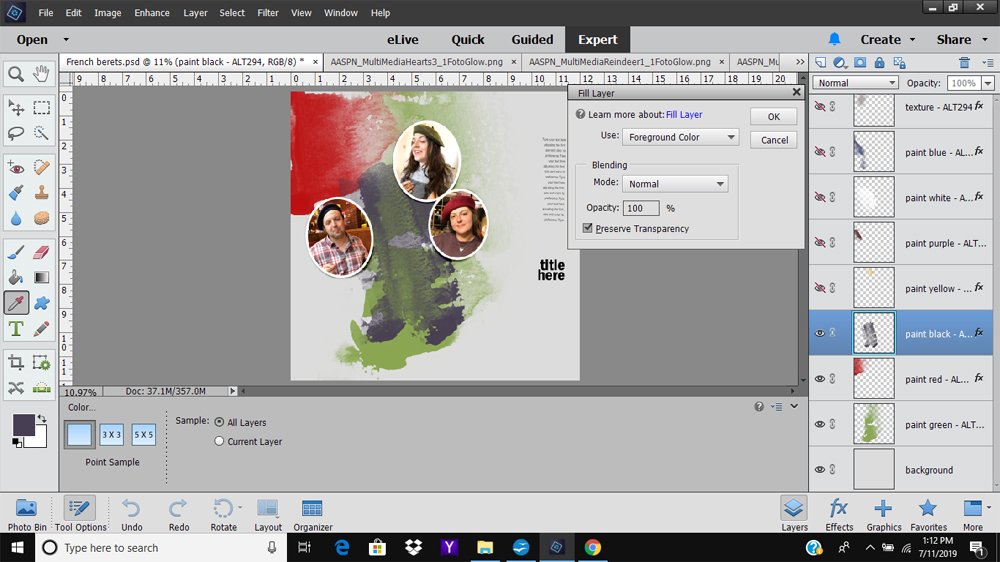
- Select the layer to be recolored in the Layers Panel.
- Click on the Foreground Color in the Tools Panel to access the Color Picker.
- Sample a color from one of your photos by clicking on the image in your layout.
- Go to Edit> Fill (Layer) and ensure the Preserve Transparency box is checked
- Click OK.
4. Repeat the Process
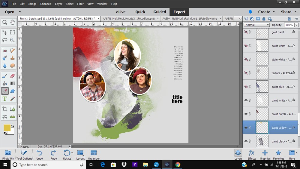
Continue working one layer at a time.
- The next layers—yellow, purple, and white—all coordinate with the photos and so no adjustments required.
5. Additional Adjustment Options
In addition to recoloring, you can:
- Re-position the element using the Move Tool.
- Rotate the element using the Transform Tool (CTRL/CMD + T).
- Flip Horizontally/Vertically (Edit> Transform in Photoshop or Image> Rotate in Elements.)
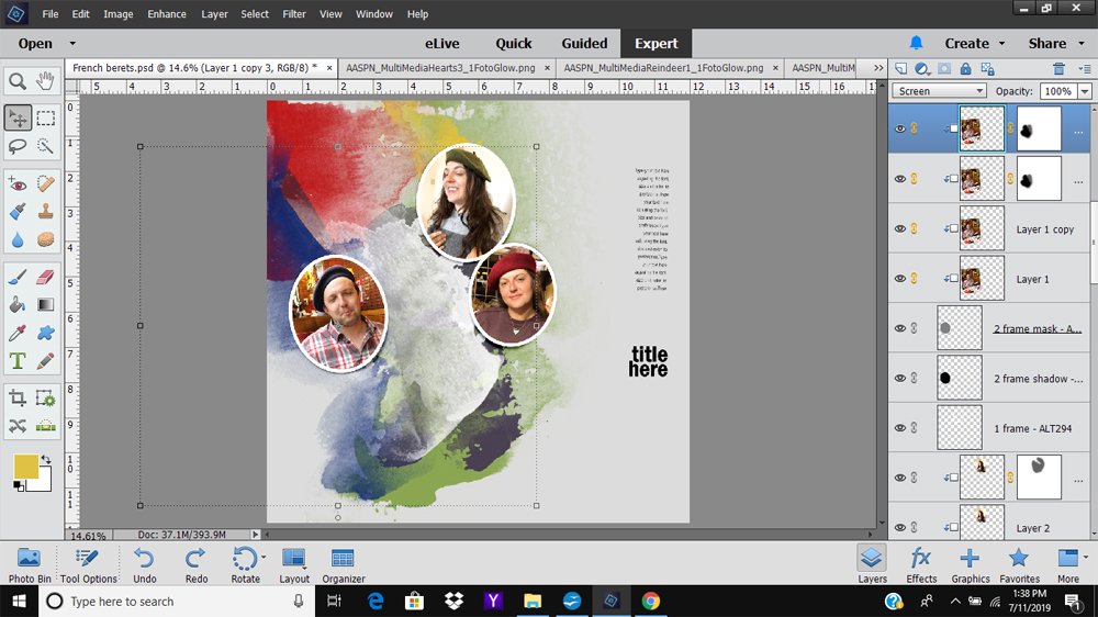
Note. Laura could have changed the color of the ‘blue’ layer, but instead decided to flip and move it to the opposite edge of the layout – This adds visual interest and leads the eye from the left to the right side of the page, but impacts the text box placement.
- Laura resized and re-positioned the text box.
- The left photo was enlarged to mirror same size and shape of the other ‘heads’ in the layout.
Tip. It’s OK to make adjustments as you work as one change will necessitate another in your layout design.
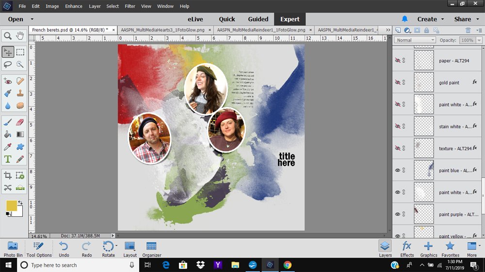
6. More Layer Assessment
Continue working your way through the layers in the Layers Panel.
- The next layers —texture, white stain, a slash of white paint, gold paint, and paper – all coordinate well with my photos and progressing layout design.
Note. Laura like the emergence of the abstract butterfly shape which was completely unintentional.
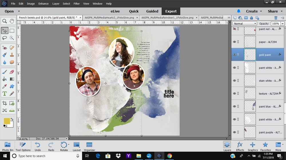
7. Using Adjustment Layers
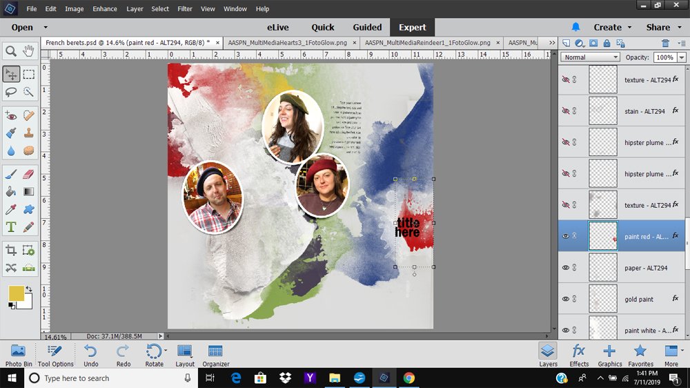
Use Adjustment Layers as a editable approach to changing the color of the red paint behind the ‘title’ placement.
- The red paint and the darker red of the beret hat in the photo to the right of the layout differ in terms of the color shade and saturation.
- Either the color of the hat, or paint needed to be adjusted.
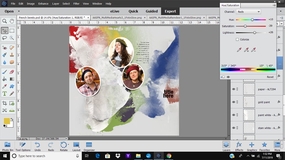
Laura decided to change the color of the paint layer using a Hue/Saturation Color Adjustment Layer.
- Highlight the paint layer in the Layers Panel.
- Click on ‘Create New Fill or Adjustment Layer’ icon at the bottom (Photoshop) or top (Elements) of the Layers Panel.
- The icon is depicted by a circle divided in 2 and half filled.
- Select the Hue/Saturation option from the menu.
- Clip the Adjustment Layer to the paint layer so that it applies only that layer (as opposed to all underlying layers.)
- Select Reds from the Channel drop-down menu to affect the red colors only.
- Move the sliders to modify the color.
Note. Laura could also have applied the same values to modify the red paint at top left, but repetition with a little variation always makes for a more interesting design.
See also this excellent video exploring Color Channel options in Hue/Saturation Adjustment Layers by Creative Team Member Linda Davis.
8. Embellish with Digital Artistry
Add embellishment via [aalogo] DigitalART, WordART and personalize with your own words.
- Add embellishment such as the Smiley Face and black button from ArtPlay Palette Uplift.
- Duplicate element layers changing the size and color as preferred.
Tip. Use a Hue/Saturation Adjustment Layers to change the color of embellishments to coordinate with your photos.
Summary
You can make any Artsy Layered Template work with your photos via simple modification techniques.
- Turn on/off the visibility of any layer(s) in the Layers Panel.
- Re-position layers using the Move Tool.
- Rotate layers from the Edit> Transform (Photoshop) or Image> Rotate (Elements) menus.
- Recolor using Edit> Fill (Layer) or Adjustment Layers.
Excellent guidance for layering color to coordinate with colored photos! Love this trio of photos and Laura’s love/understanding of color!