
Today, I’m sharing 6 Tips for Using Colorful Digital Scrapbook Supplies in your photo artistry and memory keeping.
Introduction
Approaches for combining your photos with brightly colored digital designs.
- Color is an ELEMENT PROPERTY to be considered in your layout designs.
- Bright colors have MORE impact in your designs.
- It’s important to maintain a BALANCE with your photos.
More Information:
1. Create an Extraction
Remove the background from your subject to simplify the imagery.
- Photos can have more than one FOCAL POINT.
- Background details may also detract the eye from the main subject.
- Removing these from your photo, or creating an extraction, simplifies your imagery and makes it easier to combine with bright colored DigitalART supplies.
Tip. You can also apply a Drop Shadow Layer Style to your extracted image to add dimension and ‘distance your subject a little further’ from the artistry.
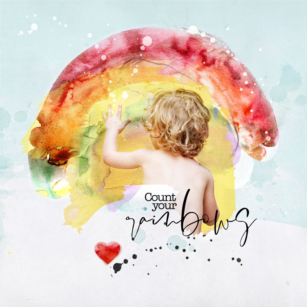
Count Your Rainbows | Adryane
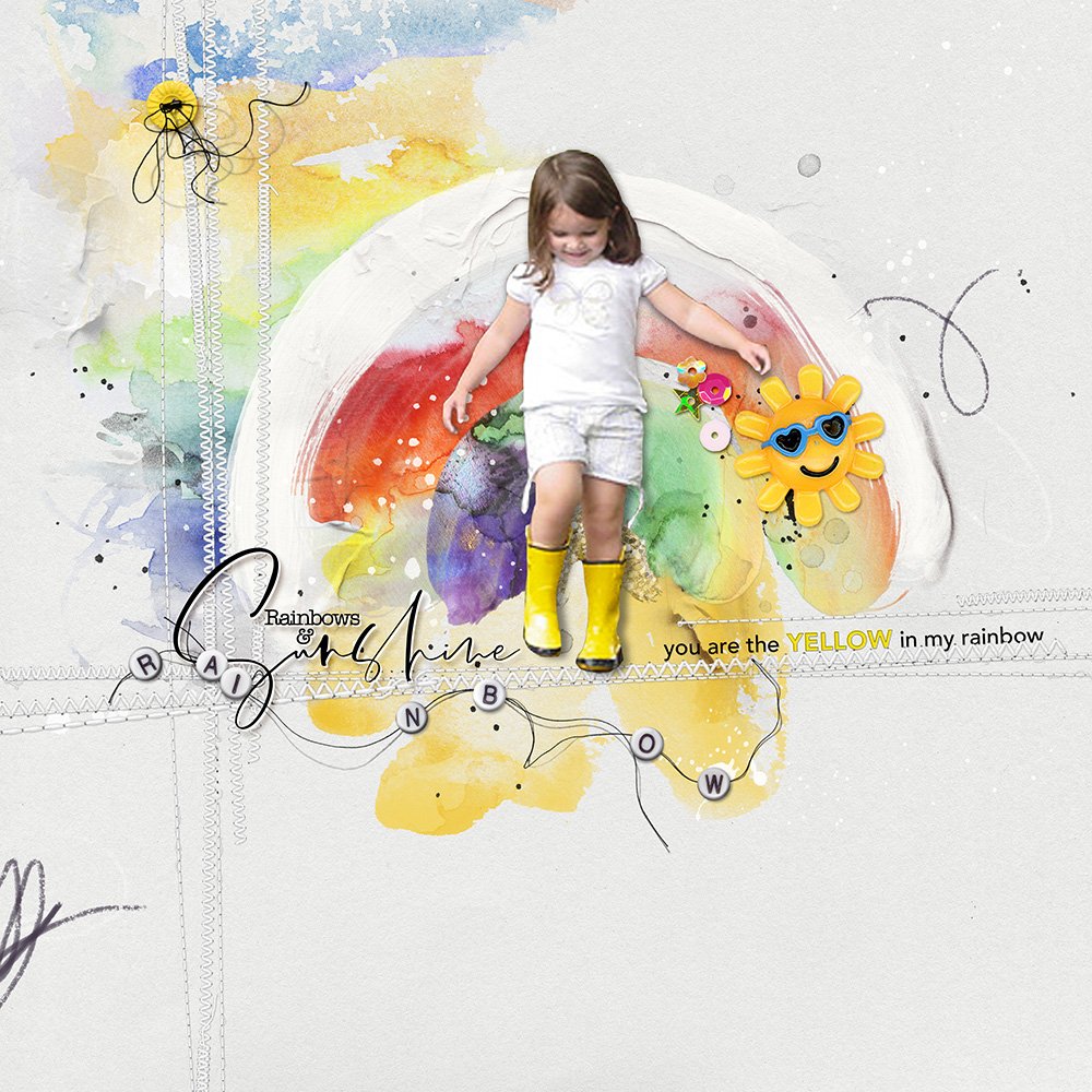
Rainbow & Sunshine | Miki
2. Use White Space
Incorporate more white space to balance your layout design.
- This Design Principle is crucial to balancing the TENSION found in bright colors.
- Can be applied to BOTH your photos and DigitalART supplies.
- Pay attention to ratios of WHITE SPACE in pleasing layout designs.
Note. Learn more about WHITE SPACE in Element Properties and Design Principles.
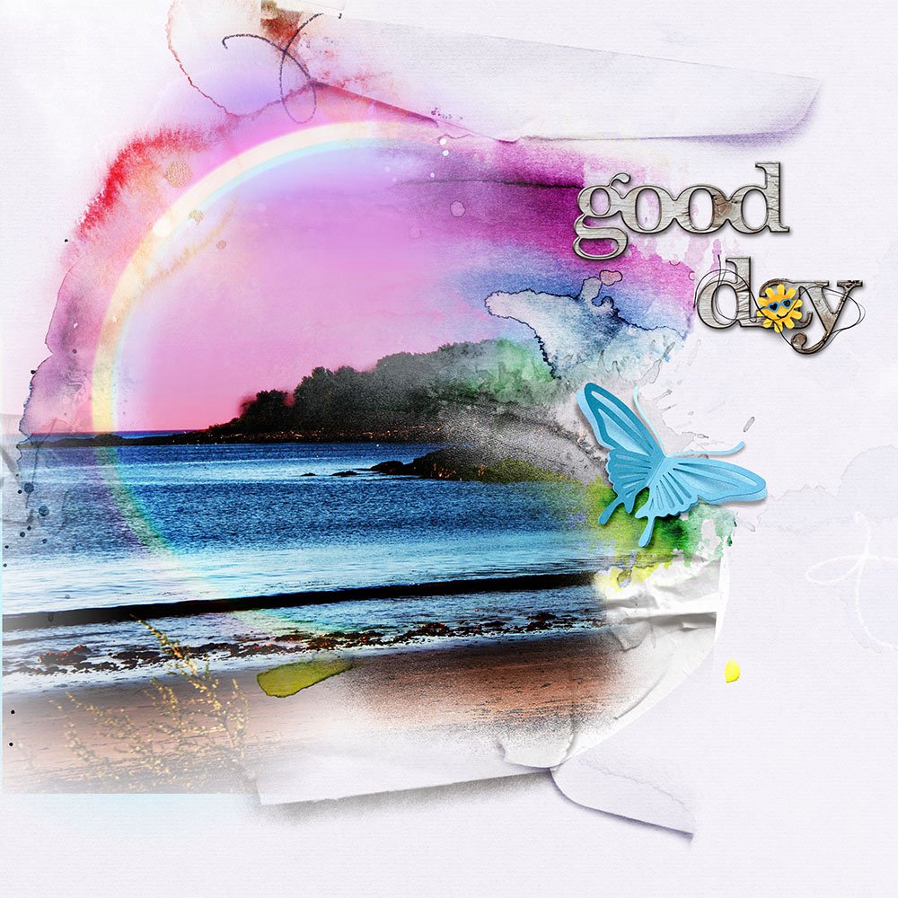
Good Day | Joan
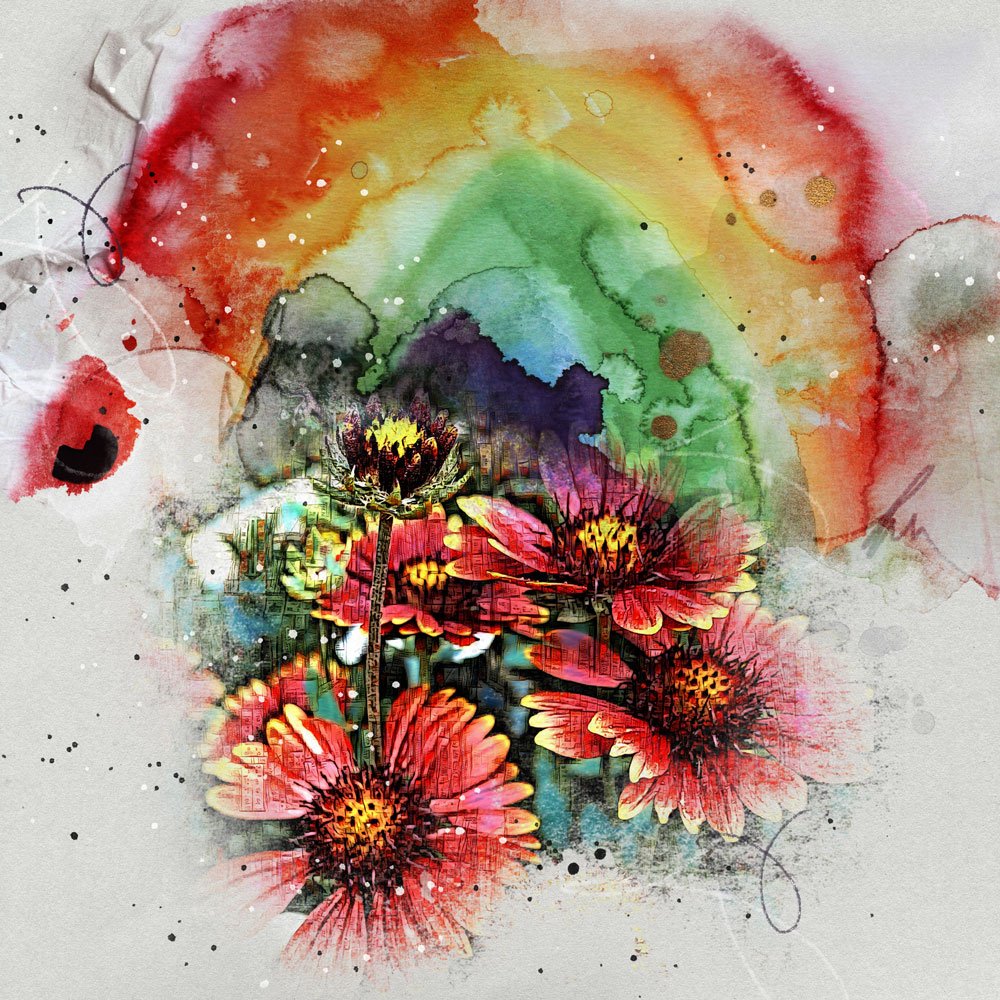
Over The Rainbow | Trish
3. Completely Color Coordinate
Make sure your photo colors match those of your DigitalART supplies.
- Choose colors in your DigitalART supplies that are are the SAME as those in your photos.
- BALANCE neutral light colors with more BOLD ones.
- Incorporate WHITE SPACE.
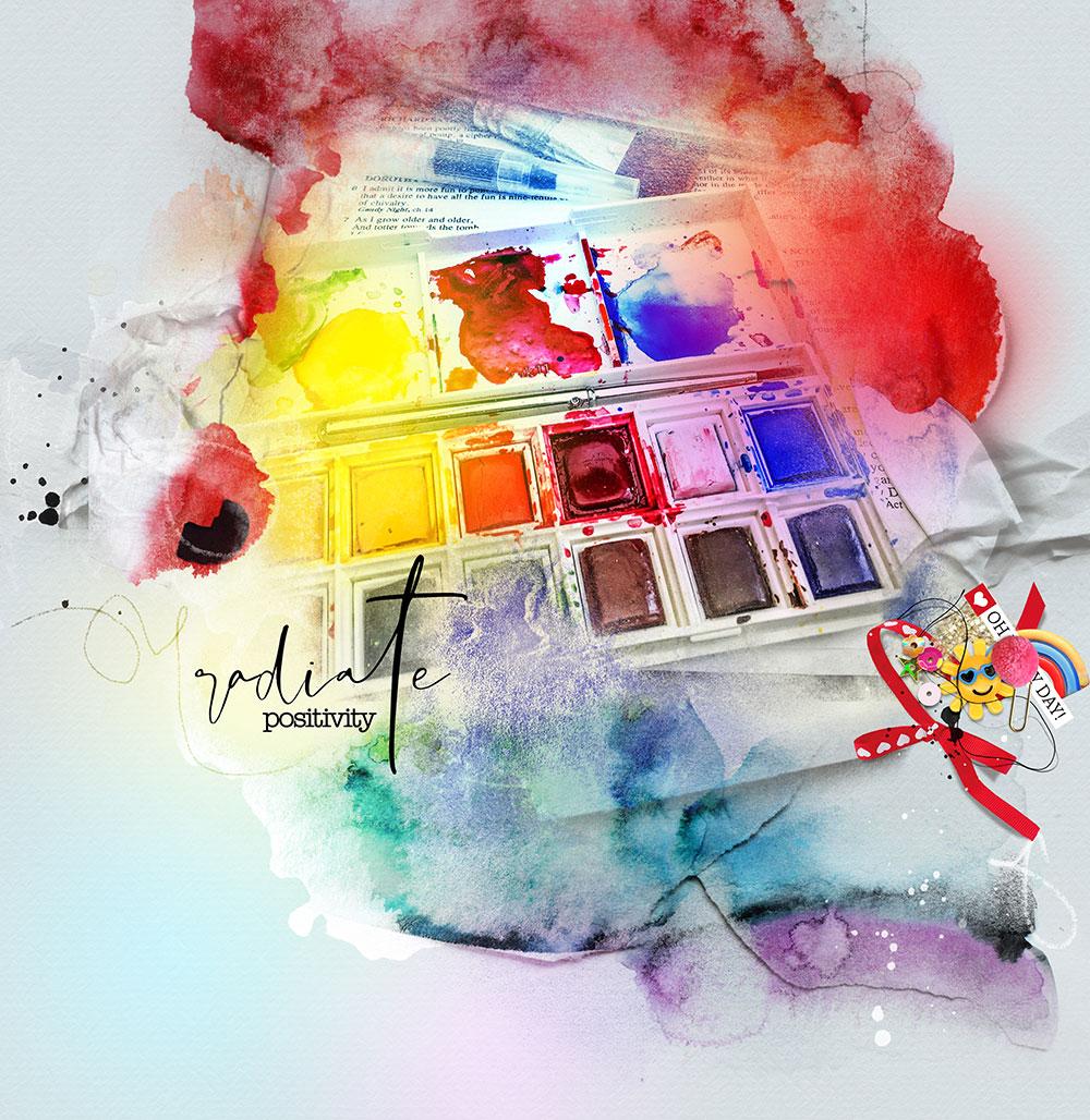
Radiate | Viv
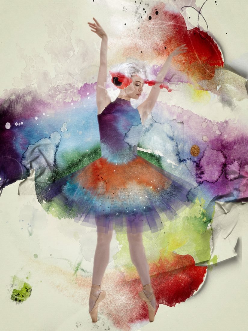
Ballerina | Lou Ann
4. Desaturate Your Imagery
Remove some or all the color from your photos or DigitalART supplies.
- Go to Image> Adjustments> Hue/Saturation (Photoshop) or Enhance> Adjust Color> Hue/Saturation (Elements).
- Move the Saturation slider to the LEFT to gradually remove the color from your photos or DigitalART supplies.
- Yield a Black and White Photo by moving the slider ALL the way to the LEFT.
Tip. Use LEVELS to adjust the brightness and contrast of your desaturated image – See Useful Techniques in Photoshop and Elements video for further guidance.
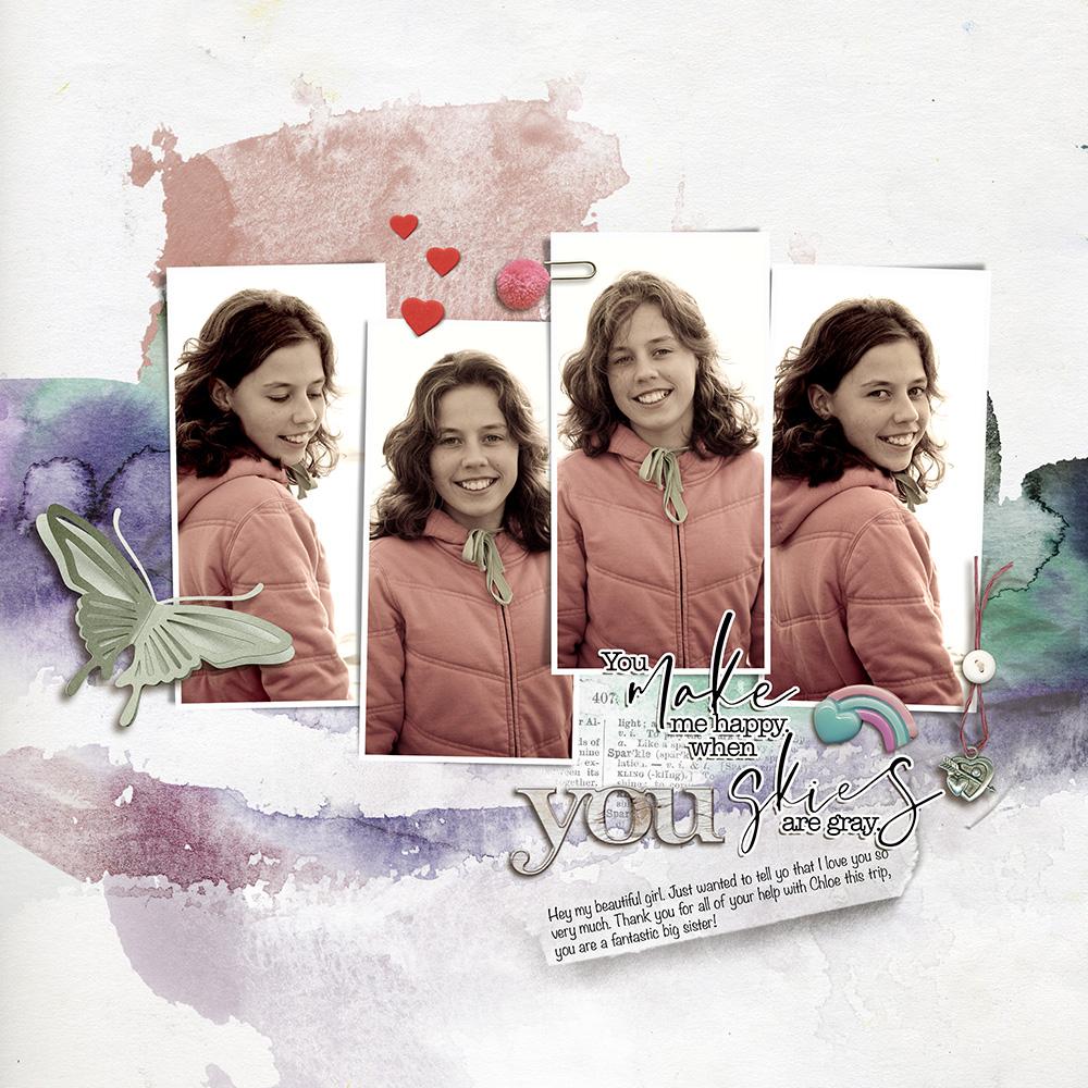
Beautiful Heart | Heather
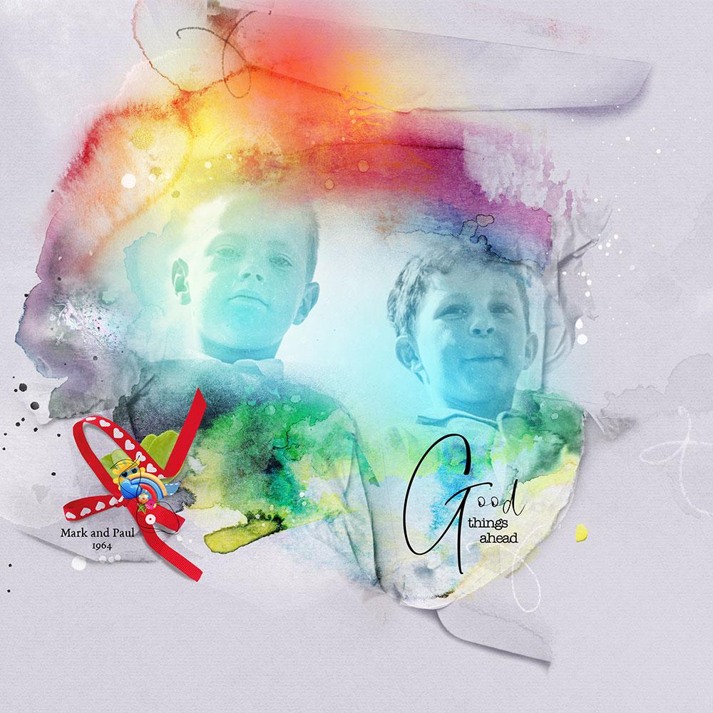
Cousins | Viv
5. Frame Your Imagery
Add white space around areas of interest to create visual separation.
- Add a frame to a photo to provide a line of SEPARATION between the image and the artistry.
- Add WHITE SPACE around a composite to frame the FOCAL POINT.
- NOTICE the impact this framing effect has when you look at the layout designs below.
Tip. Learn more about grouping and separating elements to create sound layout design Element Properties and Design Principles.
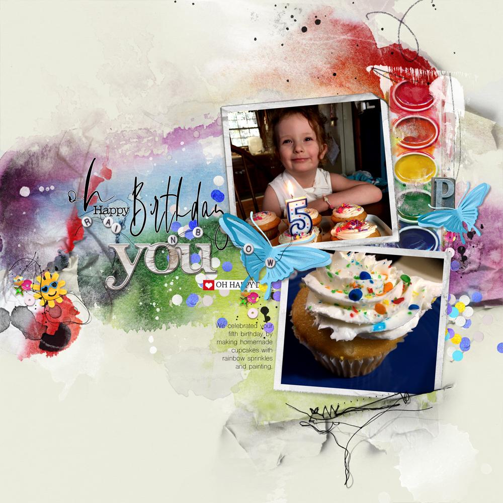
Birthday Rainbow | Nancy
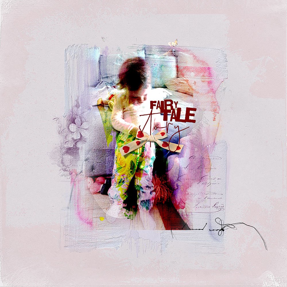 Fairytale | Margo
6. Introduce Greater Contrast
Add an element or Color into your design with even greater contrast.
- Each element has it’s placement in the HIERARCHY of your layout designs.
- This is based on ELEMENT PROPERTIES.
- Colors can add TENSION or BALANCE to a design.
Tip. Add BLACK to your design to ‘supersede’ the colorful impact of colorful.

Warhol | Adryane
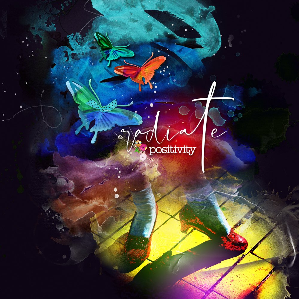
Radiate Positivity | Marnie
Summary
Color is an important element in creating AWESOME layout design.
- Learn the ELEMENT PROPERTIES of Color.
- Notice the role they play in your layout design.
- Use these Element Properties to create TENSION and BALANCE using DESIGN PRINCIPLES.
WE INVITE YOU TO:
- Learn more in Element Properties and Design Principles
- Peruse or post to the [aalogo] Gallery.
- Watch Narcissus Color Considerations and Adjustments
- View [aalogo] Connect 11 May 2020 REPLAY available for a limited time.
- See Color Matters [aalogo] Blog post.
- Visit the Anna Aspnes Designs store at Oscraps.
A helpful list to keep in mind! I adore color but it can overwhelm the image or message of the art. APP Rainbow is a one I’ll use a lot for scrapping grandchildren and Disney photos. Thanks for the tips, Anna!
Yes! I do love bright colors though – And these tips will help you incorporate your photos without that overwhelm.